Dark UX Patterns: What Are They, and Why Do They Negatively Guide User Behavior?
October 23, 2018
October has arrived, and with it, all the joys of the Fall season: changing leaves, apple picking, corn mazes, pumpkin spice lattes, and, of course, the annual celebration of all things spooky, but when it comes to user experience, the creepiest of elements out there are Dark UX Patterns, and they’re much too vile and icky to get excited about.
“Dark UX Pattern” is a term that refers to unethical interface tricks (not treats!) that are intended to manipulate or mislead users into following behaviors that are beneficial to the business, even if it isn’t what the user wanted or expected.
There are countless Dark Patterns out there, and you’ve probably seen a few of them yourself.
Here are a few examples you’ve probably encountered:
Forced Continuity
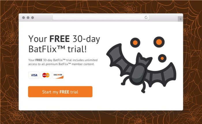
Ever sign up for a “free trial” of an online service, but were required to enter a credit card number in order to claim it? This is a perfect example of Forced Continuity, the most common Dark Pattern. The user accepts the free trial, and before they know it, months have passed, and they have unexpectedly become a paying customer without ever having explicitly opted in to the paid service. The company offering the free trial doesn’t do so because they’re so confident that users will enjoy the service that they’ll continue to pay for it. They offer the trial because they know users will likely forget to cancel the subscription, and will become paying customers whether they intended to or not – after all, they already have their credit card details.
Confirmation Shaming
The goal of Confirmation Shaming is to make a user feel embarrassed or ashamed about making a decision that is undesired by the business, like canceling a subscription. Typically, this is done by using language that has been deliberately written in a psychologically manipulative way to create feelings of guilt or loss in the user when certain actions are taken. This mental manipulation is intended to make the user feel as if they need the service, even though they may not really want the service.

Roach Motel
The Roach Motel is not unique to the user experience world, and if you’ve ever tried to cancel a gym membership, you’ve undoubtedly experienced this spooky tactic first hand. The concept of a Roach Motel is simple, and a lot like Hotel California – it’s easy to check in, but you can never leave. There are countless variations of Roach Motels, but the most common is preventing users from canceling their accounts. This is done in one of several ways:
- Making the opt out option impossible to find
- Artificially narrowing the window of time that users can cancel a subscription
- Making the actual process of opting out so immensely frustrating and inconvenient that the user is likely to keep putting it off

Misdirection
Misdirection is another common Dark UX pattern that is used to distract users and move them toward an option that is preferred by the business, while minimizing the option that has lower business value. This is usually accomplished with misleading page layouts, using bold, bright and impact-demanding visual elements that draw the user’s attention, and manipulate them into picking something they probably didn’t want. Misdirection takes advantage of the user’s trust by exploiting their assumption that the most highlighted option they see on the page is the option they should select.
Bait-and-Switch
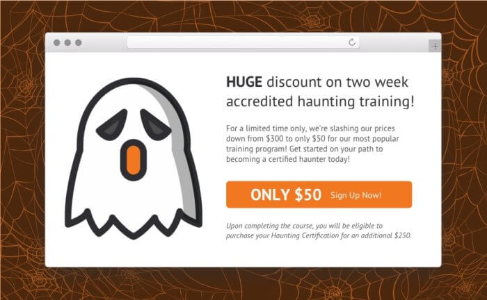
The Bait-and-Switch is a common deceptive tactic designed to mislead users into taking an action that they believe will have a particular outcome, only to find out later that the outcome they expected will cost or require more than anticipated. Once the user has committed to the action, it’s usually already too late to go back. Bait-and-Switch tactics are most common with online training, where the program is offered at a too-good-to-be-true discount. Once the user has registered, paid, and committed several weeks of their life to completing the training course, they discover that the actual certification is available for an additional (usually larger) fee, and they’re left with two options: give in to the immense pressure of paying extra for what they thought they were getting in the first place, or cutting their losses with no certification to show for their work.
So why are Dark UX Patterns a bad method to guide user behavior, and how can they be avoided?
Dark UX Patterns can, and should, be avoided in a number of ways:
- Openness and transparency: Users should never be blindsided by unexpected consequences. For example, users should be notified in advance when a free trial is expiring, and should be given the option to either begin a subscription when the trial ends, or discontinue the service. The default behavior of an expired free trial should never be to silently convert the user to a paid customer.
- Every action should have an equal and opposite reaction: The user’s decisions should be easily reversible, and should never include arbitrary barriers designed to prevent decision reversal. For example, account cancelation should be as simple (or as close to simple) as account creation.
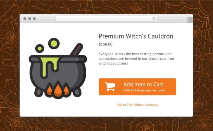
- Lateral options should have equal weightings: When presenting the user with two similar, but different options, the more prominent choice that the user is more likely to select should be accentuated. For example, the user will probably not purchase a product that comes with additional bundled expenses. If there’s a choice between this and the product without add-ons, they will need clear-cut guidance, and will appreciate not being tricked into purchasing what they don’t need.
- Unbiased language: Users should never be manipulated into making decisions by language that makes the user feel guilty or ashamed of their decision.
Dark UX Patterns ignore the user’s wishes or requirements, and use deceit and manipulation to trick users into making decisions that are in the business’ best interests, in the short-term, but long-term, can lead to distrust and brand aversion.
Good user experience design is about user centricity – providing the user with the options they need within the context of what they want to accomplish. More importantly, user centricity is a thoughtful commitment to prioritizing the user’s interests, and in doing so, can make a product or service stand out from competitors while developing trust and comfort with the brand, which encourages brand loyalty and, ultimately, profitability.